Book Cover Design
The Old Man in the Corner
an Edwardian armchair detective serial anthology
Team Members:
Tiffany Watson, Book Designer
Project Description:
I played around with three different concepts before developing the final design
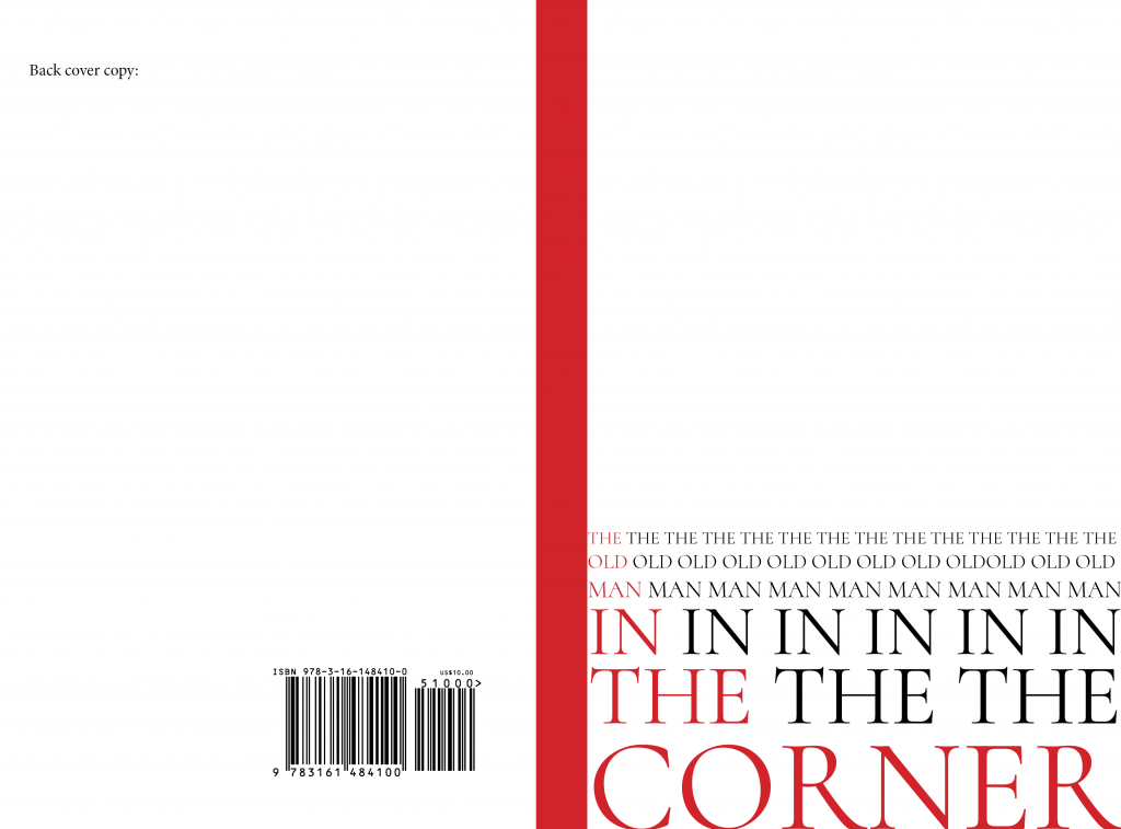
Concept 1 was stylized like a 80s or 90s thriller. I kept the font in the bottom third of the page and had each word in the title separated to a single line and repeated until it reached the left margin of the page. The words gradually become larger as it progresses until “corner” takes up the whole bottom of the page. The effect is gradual and I highlighted one of the words in each line to give the appearance of a staircase.
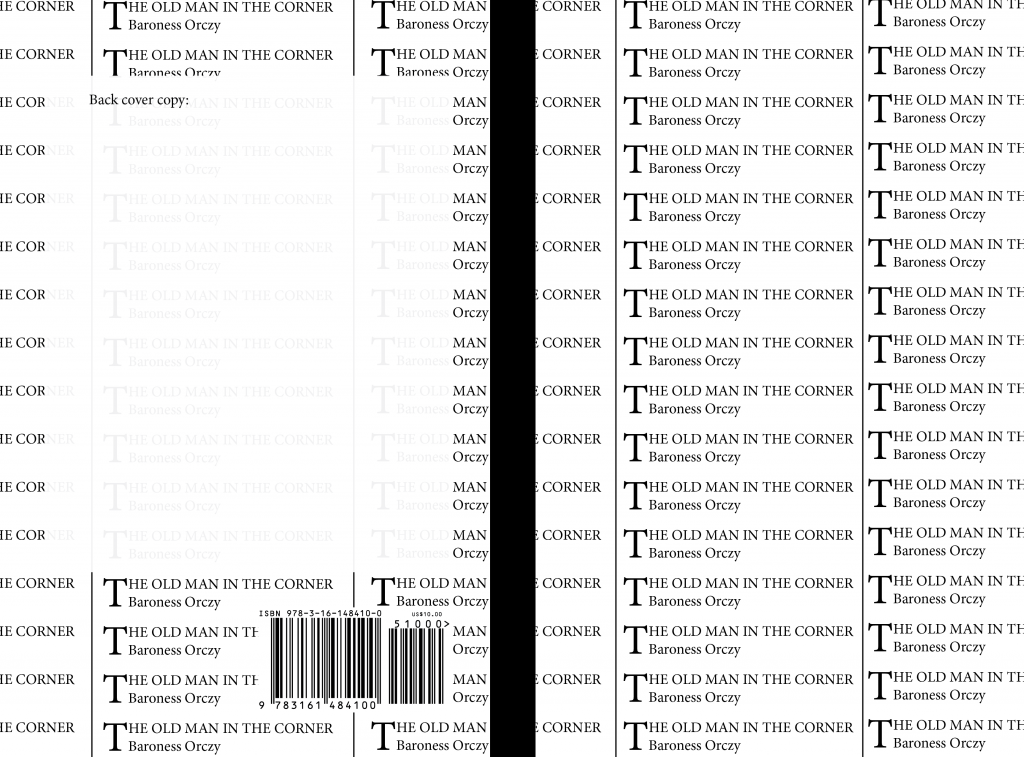
Concept 2 was a replication of the newspaper formats seen in the Edwardian period notices. These small messages began with a drop cap to distinguish them from each other, so I replicated this format with the book title and author name. Important detail to note: the novel involves a framing device of a journalist interviewing the detective.
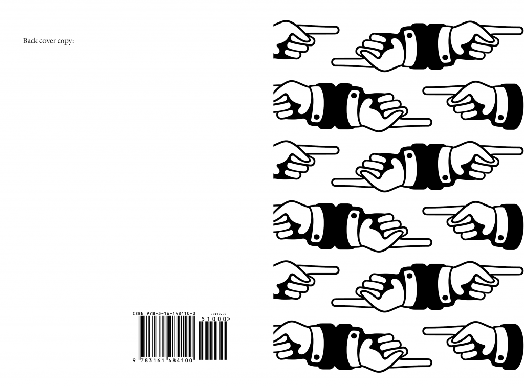
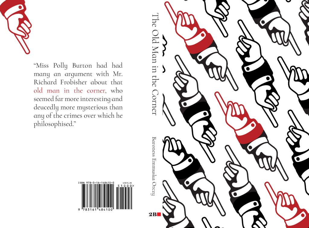
Concept 3 was the most abstract concept. The detective is constantly pointing to small details which he uses to solve the case so I utilized typographer’s fists for my design. I arranged them so one fist is pointing left and the other is flipped to point right, I repeated this in a pattern horizontally, then copied the pattern vertically to cover the whole page.
The Final Design blends Concept 1 and 3. I used the typographer’s fist but instead of having them arrange horizonally, I anngled them to point at the “corner” of the page, referencing the title of the book, “This Old Man in the Corner.” I then used the red highlighting color I did in Concept 1 to highlight the fists which were point directly at the right corner of the page.
Faultland
a spec fic set in Portland Oregon in the fall out of Cascadia Earthquake.
Team Members:
Tiffany Watson, Book Designer
Project Description:
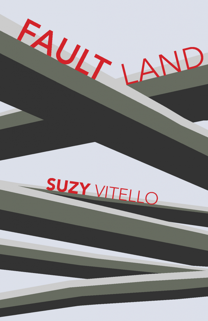
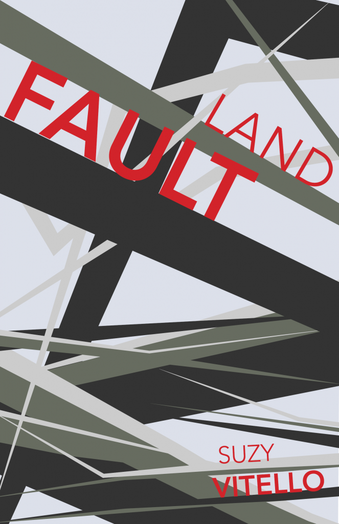
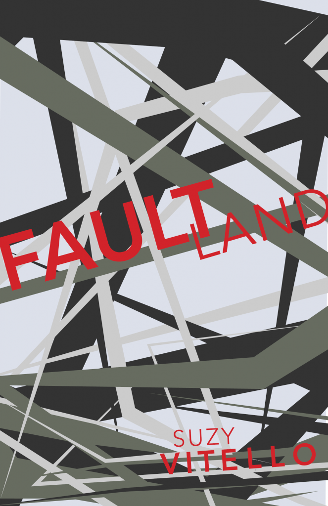
I based the design on the Marquam Bridge overpass in Portland Oregon. I used shades of grey to highlight the overpass, then placed the title and authors name on specific lines of the overpass. In later rounds the destruction of the earthquake takes up more focus than the bridge, creating more jagged lines and points, more abstract.
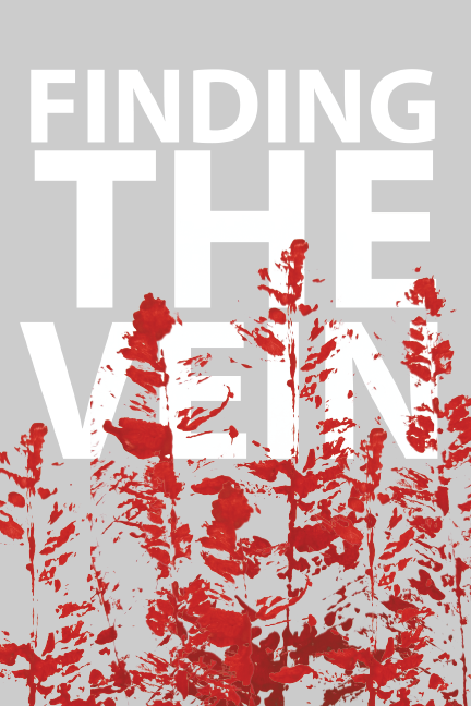
Finding the Vein
a murder mystery at summer camp.
Team Members:
Tiffany Watson, Book Designer
Project Description:
The cover is pretty simple. I have the title very prominent, taking up two thirds of the cover with an overlay of “blood spatter trees”. The trees were created using acrylic paint and a fern. I snapped a photo of the painting then uploaded it to Illustrator where I isolated the color and created a digital image for use in InDesign. The author’s name is missing as I didn’t develop the idea into a complete design.